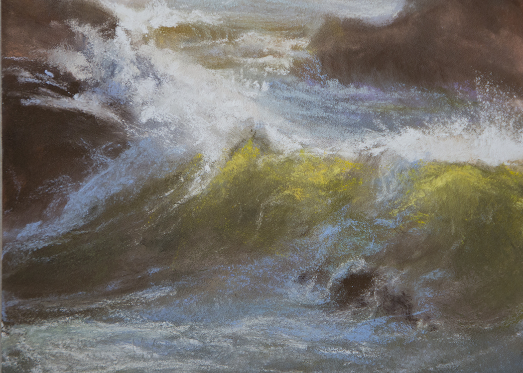
November 16, 2009

Calendar Art Project


This past month has been pretty much wrapped up in making calendars which I thoroughly enjoy doing but I do find myself longing for the feel of pastel dust between my fingers or the smell of a freshly laid palette of oils. I admit to sneaking in a day here and there just so I could get that "ahhh" moment.

So, I thought I would share what I've been working on that's kept me so far from my easel's edge. They are little desk-sized calendars of my art. I think it's a really good exercise to see one's own work grouped together and to have to scrutinize and make the tough choices about which images get cut. It reminds me of the submission process for exhibitions. It's not always about being the prettiest picture. Sometimes it is a matter of balancing how one image looks when grouped with 11 other images. I also found that, on occasion, I couldn't include the image I initially selected because when it printed, the colors didn't hold up to the original as well as I would have liked. I find that happens most often when there are strong complementary colors competing with each other.

I really wanted to focus on these calendars as miniature art which is why I included the mini easels as part of the package. Besides that, I think these easels are just adorable. With that in mind, the paper and image quality were paramount for this project. For those of you who might want to try this at home...I decided on Moab Lasal double-sided Photo Matte paper. It's spendy but worth it if what you want is a top-quality feel to your little print (or big print). Even though I'm not printing on both sides, I like that the paper is thick, rich and is the same color on both sides. The colors come out beautifully on my Epson printer. Well, now that those are done, I am off to the easel! Yay.

The calendars I did for this year are CATS, SEASCAPES and BIRDS. You are welcome to view (and purchase) them on my wesite:

October 05, 2009

Why Use Colored Pastel Paper?

I love, love, love different surfaces to paint on and a variety of them to choose from is an important factor for me when trying to plan for the best outcome for a painting. While posting this painting, “Return Ever Safely,” I was thinking about what an important role the color and texture of the paper can make in the outcome of the piece. The paper I chose for this is Sennelier La Carte Light Grey. The name of the color is deceiving because in reality, it is a nice warm brown tone. I chose this color because I wanted that color to dominate the painting. I also chose Sennelier La Carte paper because it has a wonderful sanded surface that enables the pastel to just skim the surface and that’s just the look I wanted for the driftwood highlights. I stayed away from the buttery-soft pastels because I wanted the brands that would tend to sit on top of the sanded surface. I therefore chose primarily Unisons and Diane Townsends to get the effect I was after.


RETURN EVER SAFELY
11 x 14 pastel
a bit more about this painting...
The swallow was often the first sign sailors saw when approaching land and, as such, they became a symbol of hope and, later, one of honor. They were so revered by sailors that after sailing five thousand miles a sailor would have a swallow tattooed on his chest to proudly display his ability to weather many storms at sea. After ten thousand miles a second swallow-tattoo would be added to the other side of his chest.

I was reminded of this legend while visiting our nearby beach on Whidbey Island (Washington). I saw this swallow resting on a stump of driftwood and wondered if it was beckoning to a certain sailor in the nearby ocean.

Purchase information is available on my website.

September 29, 2009

A poem for my pastels


Be still my heart whilst I paint
so that I might hear the pastel
as it glides across its sanded surface,
textured like a sweet cat’s tongue.
The sound, like a violin
and the sight becomes the orchestra.

                                           ~sandy byers

September 21, 2009

Waking Up...and happy

One thing led to another and I found myself at a friend's blog that I contributed to last year. I still feel the same today as I did when I wrote this (then) and want to share it here. I also want to share Robin's Paint a Positive Picture blog because I think anytime we share something positive, that's good for all of us.

This is the painting:


"Waking Up"
Soft Pastel 11"x 14" (sold - thank you :)

And this is the positive thought that went with it:
The blessings of each day are not always obvious unless they are the very first thing one looks for when opening your heart's eyes in the morning. Already being blessed with health and a perfect family seems enough for any one person. For me, when you add to that the joy of rubbing pastel dust between my fingers, and the sound of the pastel gliding across a sanded surface, that cup begins to spill over onto everything. This pastel painting of Camano Island, the morning view from my studio on the east side of Whidbey Island, is just one more reason I can't help but put on my happy face when I open my eyes in the morning. From where I stand, each day is a day to look forward to and that makes me smile.

September 14, 2009

Peace after All

Happily, I am back to say that after three failed attempts, the painting that “wanted to be” delivered itself on my easel. Whew. I was really beginning to think I had lost my touch. In fact, what I just did was gain my loss of control. What a sense of freedom that is! It is difficult to let go and just allow the painting to take over, especially when I think I know what needs to happen; when I have “a plan.” Funny, I think I’ve already learned this in life and now it is manifesting itself right on my easel. Right in my face. That is reinforcement. So, I am going with it. And, I can say it has been a bit tough lately but I can also say I have made the longest and most rewarding strides in my work since I’ve made these latest “allowances.”

It isn’t always about the result. Sometimes, it is about what I learn as I move from one phase to another and that is what I see when I look at a piece of work. That is why I can love something I finished years ago and, even though it is technically incorrect, it may hold personal value to me – it may hold an entire life-lesson. I am not running around trying to “fix” what I did back then. I am trying to build upon the knowledge I have spent a lifetime investing my heart in since then. This is the piece that would not be refused and would not succumb to my directives:


Proof of Peace
16 x 20

As always, thanks for stopping by and, for you artists....
may you find peace at the easel.

August 26, 2009

Bye Bye Painting!

I’m currently working on my next body of work for a gallery show in Anacortes, Washington; one of my favorite little coastal towns in the ever-beautiful Pacific Northwest. I’ll be showing at the Scott Milo gallery and I really enjoy showing at such a warm and welcoming place. Kathy, the curator, always selects nice pieces (oh, I hear a horn tooting) and does a wonderful job of displaying the paintings alongside some gorgeous sculptures and jewelry.

The topic that came to mind while working on this new body (no not mine, though it could use some work) is how tough it is to give up on a painting once I’ve committed to it but can’t get all the way in to it. Yes, this just happened. While I think commitment is a great thing, and has served me well in lots of ways, I’m learning to let go of some of it. Finally. So, I am tossing more paintings lately. Well, okay, not completely tossing them but stopping them in their tracks and using them for something else later.

Here’s my analogy for this; I liken this to a bad relationship that consumes lots of time and energy but you know it’s just not working. I could just keep putting more and more paint on the canvas and try to cover up all the ugly stuff I don’t like but if I did that several things would happen:

A. I wouldn’t be happy while I was doing it.
B. I would be wishing I was working on something else.
C. I’d be grumpy because deep down I would know I was wasting my time and creativity.
D. I would be working on this which means I wouldn’t be working on my potential masterpiece.

I’m off to work on something I love. I'll be back...

August 21, 2009

Tuxedo Maine Coon Oil Painting


"One Good Scratch"
8 x 10
Oil on Panel
SOLD (thank you :)

I often ask myself what it is that seems so endearing about every single move Biscuit makes. In this painting I have captured one of the activities she probably performs at least twenty times throughout the day; that yummy little scratch right behind her left ear. But, look how graceful she looks when she's doing it! Even when she is scratching, her inside beauty radiates through to the outside.

In this oil painting on panel, I combined fine-detail brush work and highly textured palette knife work to create an exciting piece of textural art. Once completed and dried, I hand-brushed 8 coats of crystal-clear varnish, patiently waiting (not my strong suit) for each one to dry before applying the next. Parts of the painting look like shattered glass because of the richness of the varnish. In other parts of the painting, the texture of the panel is apparent. The overall painting has a very "deep" feel to it because of the varnish. I used what I think is the best varnish available - it's Gamblin and it is as clear as it can possibly be. Yum.